Saturday, January 30, 2010

Day 31: Abstract Lights


Another simple effect but still learned a few things. The Wave filter is a bit weird and unpredictable. Once again I played with alternative ways to rotate the same object. I'm not sure what the practical application of something like this would be other than creating a trippy wall paper or abstract background for another design.

Tutorial link
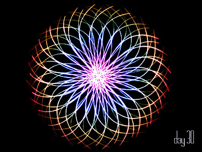
Day 30: Spiral Lights


Somewhat simplistic but I realize after doing all of these tutorials that a side benefit is learning keyboard shortcuts. While I preach to my students to use them I find that I only use a few of the tool shortcuts and rarely any of the layer creation shortcuts. I'm starting to focus on ingraining these shortcuts into my head. It speeds things up significantly and I can pass on the more relevant ones to my students beyond the few I give them now. Cool beans.

Tutorial link

Friday, January 29, 2010

Day 29: Fiber Lines


Pretty neat techniques on applying color overlays instead of using gradients. I liked the blurred color effect.

Tutorial link

Day 28: Light Eclipse


Really great tutorial (although a bit tough). I created a cool rectangle brush and applied several filters, textures and an image. Spiffy!

Tutorial link

Day 27: Planet


Continuing my space theme. I really dig how this planet turned out. I will undoutably come back to this one and try it again!

Tutorial Link

Day 26: Star Field


Here is the star field tutorial I talked about. It was a bit difficult to follow. The effect is definitely better than the random noise I used on the last one. I need to practice more in order to create a realistic star field. I wasn't sure which areas to erase in order to make it appear more natural.

Tutorial Link

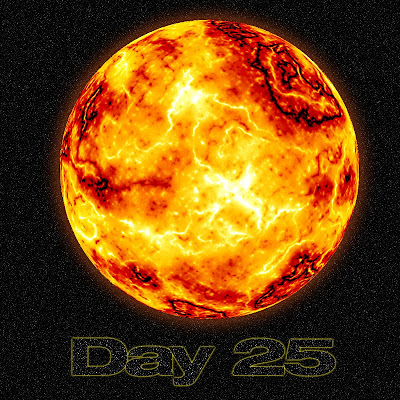
Day 25: Sun


I used no images to create this. Simply used photoshop to create clouds, sharpen layers and then adjust the colors. I tweaked with the glow a bit but it's not quite the effect I was going for. The star field could use some tweaking as well. I ran across a star tutorial a while back that I may have to try with this sun effect.

Tutorial link

Sunday, January 24, 2010

Day 24: Light Burst


Neat overall effect. I need to tweak with the letters to get a better center burst of light. I think the gap between the 2 and 4 didn't allow for a strong burst... I'm going to try again with a different set of text... Here it is... a bit better but something is still off a bit.


Tutorial Link

Saturday, January 23, 2010

Day 23: Wanted Wood


Cool wood engraved text. The bullet holes didn't turn out as nicely as I would have liked. The smoke effect is decent. I like the "DAY 23" lighter blend effect.

Tutorial Link

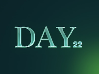
Day 22: Glass Blue Text


Ehh.

Ok style but not really that impressive of a "glassy" effect. I'm not sure if the font if too thick to get the transparent feel or if I screwed up a layer style.

Tutorial link

Day 21: Electives Mod


Here is what students had to say about their favorite non-business or language elective.

Day 20: Permits


Here is the Sophomore with permits mod. I'm not sure how dark the license background will print out. On screen it is really light but it should print much darker.

Day 19: Sophomores


Sophomore title. The picture is from Pep Rally. It was converted to black and white after I selected the Red (sophomore class color) from their shirts.

Day 18: Pets


I've spent hours upon hours working on various yearbook layouts, mods, images etc. I'm going to post just a small sample of items.

Here is the almost completed Pet Mod... Barney is the rockstar of the page!!

Sunday, January 17, 2010

Day 17: Rust


So this was a fairly straight forward tutorial. I didn't like the background effect in the tutorial so I created a glass background like the one I created in the last tutorial. I had to tweak with the overall settings a bit but I think the effect is pretty spiffy.

Tutorial link
Saturday, January 16, 2010

Day 16: Eroded Metal & Glass Background


I loved this one! The tutorial took longer than previous ones but the techniques were great. There were a ton of channel adjustments and illustrative tricks. I absolutely love the way the background was created from scratch (no images at all!). So I've decided to continue doing text effects for a while. Once I peter out on those I'll start exploring other options but be prepared for some more text effects.

Tutorial link

Friday, January 15, 2010

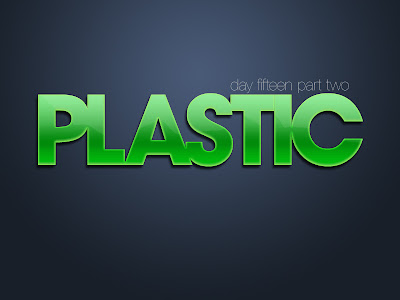
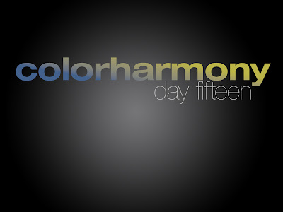
Day 15: Plastic and Gradient Overlay


The color overlay one is not really that impressive. The plastic effect is cool. I put a drop shadow on it to give the text some depth. I like the small contours in the middle parts of the letters.

Tutorial link.

Thursday, January 14, 2010

Day 14: Gold


Decent effect. Mostly layer styles and not much else. I may use this as another simple layer style for my class.

Tutorial link

Wednesday, January 13, 2010

Day 13: Electric & Flames


So the first tutorial I did was rather simple so I decided to do two today.

The first one is the green static effect. Nothing more than wind filters a few times on rotated text and a simple black fill. Not too exciting. Now I see why so many of my students gravitate towards this tutorial.

The second one was a bit more work. I like the effect and could spend more time making more flaming text. Perhaps the best thing about this is how I can use channels to make complex selections within the flames image.

Tutorial link

Tuesday, January 12, 2010

Day 12: Neon Lights


Here's a somewhat simple neon light effect. I'm not overly happy with it but I'm tired and my back hurts and I'm done looking at a computer screen. :)

Tutorial link

Day 11: Yearbook

I will get to posting this days stuff when I get to work... more Yearbook stuff.

Sunday, January 10, 2010

Day 10: Knotty Wood


Here is a cool wood grain text effect. I like the background texture. I should have moved the "designs" down lower so the border didn't run into the top word. "KNOTTY designs... get it... I'm so clever :)

Here's the tutorial link.

Day six through nine: Yearbook

So the week was spent doing yearbook stuff. The following pictures are only portions of the work I did. The font's are a bit jacked up since I'm posting these from home (I don't have the correct fonts installed on my home computer).

In the academics section (hell actually all sections) we have a hard time getting students to actually read the text we write. Since they could care less about what was done in history class we opted instead for "fun facts". To entice the readers even more we replaced some words with random pictures. We'll see if we get any positive feedback.


Tuesday, January 5, 2010

Day four and five catchup: Yearbook

Day 4: Yearbook Science Mod.


Day 5: Yearbook Academic Stats for Science and PE

So I missed posting yesterday but I did quite a few design related things at work. I figure those count :)


I figure I may be posting some of my work related designs when I'm buried in yearbook deadlines, They count... really they do :)

Sunday, January 3, 2010

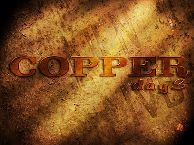
Day 3: Copper Text


I'm three days in and I 'm still going!! The text effect was long but the effect was really cool. The steps were complete and easy to follow. I should use this one as a required text effect for my class.


The tutorial is here.

Saturday, January 2, 2010

Day 2: Retro Text


Here is my 70's inspired retro text. I screwed up the lens flare a bit and am not too pleased with the 3-D effect. I do like the strip effect but I need to revisit how the fill 0% layer effect works.


The tutorial can be found here.

Friday, January 1, 2010

Day 1: Christmas E-Card


So this tutorial is one that I found and assigned to my Graphic Design students before we went on winter break. Although I looked through it, I never actually did it. Most of the kids haven't finished this one yet and I told them we would complete it when we got back from break.

Now's my chance to actually do the work I assigned to my kids.

This took me waaaayyy longer than I thought it would (approximately 1 hr).

I like the overall effect although I struggled with the stars. I want to tweak with it again when I get to work so I can show my kids how to fix it.

1 down... 364 to go :)

----
The tutorial can be found here.

365 Design

Welcome to what will hopefully be a daily posting of 20-30 minutes worth of designs. I intend to work on tutorials, graphic design projects and explore photography everyday for this coming year. I'm excited by the prospect but nervous about the commitment. As the days go by I will most likely develop a more cohesive theme around what I am doing but for now I'm going to just jump in and let the structure organically develop.

This should be an awesome "NEW YEARS RESOLUTION".