Wednesday, March 31, 2010

Day 90: Cloud Text


This was a bit of a challenge. The basic technique was to create a path of text and apply a stroke to it. The brush dynamics used were similar to the star path from the Christmas tree I did. I want to tweak more with brush dynamics.

Tutorial link

Tuesday, March 30, 2010

Day 89: Metal Text


Meh.

Tutorial link

Monday, March 29, 2010

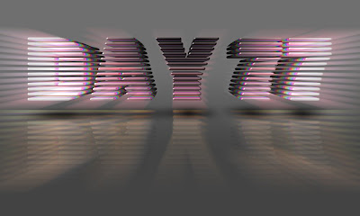
Day 88: VHS Text


I used the same font two days in a row but it seemed appropriate. The tutorial skipped over how to make the scan lines and failed to address how to blend the text into the background.

Tutorial link

Sunday, March 28, 2010

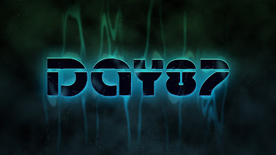
Day 87: Wavy Text


I changed a lot of the effect options to try compensate for not having the font. It worked pretty well. The wave filter was unpredictable and I think the thick font I used didn't create enough thin lines to generate the smoke. Not bad though.

Tutorial link

Saturday, March 27, 2010

Day 86: Shattered


Interesting result. I like some of the letters better than others.

Tutorial link

Friday, March 26, 2010

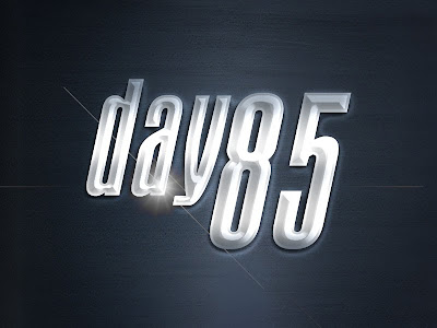
Day 85: Chrome


The first step forgot to mention that you need to create a duplicate text layer (also set that layer fill to 0%). Also the last instruction is to apply a lens flare... I filled the layer with black then applied a movie lens flare and then set the layer fill to 0%).

Tutorial link

Thursday, March 25, 2010

Day 84: Polished Metal


Another good tutorial that tweaks with almost all of the layer style options. The lens flare works.

Tutorial link

Wednesday, March 24, 2010

Day 83: Glass text


Another simple but decent effect. I should tweak the highlights a bit if I do this effect again.

Tutorial link

Tuesday, March 23, 2010

Day 82: Bubble Gun


Another simple one. A series of layer styles. I should begin to save these layer styles into a library and bring them to work.

Tutorial link.

Monday, March 22, 2010

Day 81: Watery Text


Simple and easy to follow.

Tutorial link

Sunday, March 21, 2010

Day 80: Grunge Rock Metal


Cool effect. Simple to follow and neat overall. I used a different font but I think it worked out.

Tutorial link

Saturday, March 20, 2010

Day 79: Neon Sign


This was a fun tutorial. Nuff said.


Tutorial link

Friday, March 19, 2010

Day 78: Failed Lines


Arghhh This tutorial was very poorly written. There were too many steps left out. I tried to replicate the effect as best as I could but I got frustrated and stopped. I like the brush dynamics on the lines and the sharp edge gradient but it would have been better if he had written the tutorial so it included all steps! Arghh!

Tutorial Link

Thursday, March 18, 2010

Day 77: 3-D Text effect


Wow this was a really detailed tutorial that included channels, creating two actions, repeated merging and a bit more. Overall the effect is nicely constructed and I learned a bit about the way to make an Action work for you to eliminate some repetitive steps.

Tutorial link

Wednesday, March 17, 2010

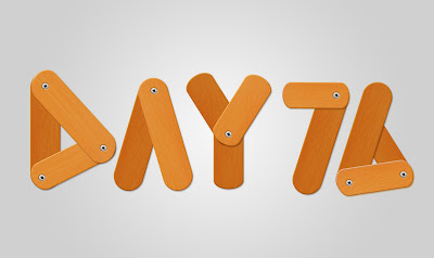
Day 76: Wooden Text


I keep finding wood related text effect. This was an interesting tutorial that was easy to follow but a tad bit tedious. My favorite part is the pillow emboss on the screws to make them appear to be pushing into the wood.

Tutorial link

Tuesday, March 16, 2010

Day 75: Flower Text


Oooh Pretty :)

Tutorial link

Monday, March 15, 2010

Day 74: Trippy Spacy text

This was a rather complicated tutorial. I sent far too long tweaking with the background. I didn't use the same font which may be why I don't like my final piece... yeah blame it on the font :)


Tutorial link

Sunday, March 14, 2010

Day 73: License Plate


Nifty License Plate effect. I need to work more with the grunge brushes to create a more natural looking distressed effect. I like the over all look but the edges could use some finesse.

Friday, March 12, 2010

Day 72: Flame Text


This was a really cool flame effect created using a series of duplicated layers set to various blending modes. The flames are actually just the same smoke image transformed into different shapes.

The letters are a bit hard to read in place and I don't like some of the more saturated areas of color but this one has potential.

Tutorial link

Thursday, March 11, 2010

Day 71: Bee Movie Text


Ok, ok... so the movie is a few years old but it was fun none the less. The effect is a made up of a series of layer styles (nothing too fancy) and a scaled down version for the smaller text. I found the honey comb picture on stockxchange and did a quick vignette.

Tutorial link

Wednesday, March 10, 2010

Day 70: Time Portal


I tricked out this sculpture image with a Stargate portal. The effect was created by first tracing the inside of the sculpture then applying clouds, equalize then glass with tiny lens (twice). I then adjusted the Hue/Saturation before using the smudge tool on the face and foot of the guy... look closely it appears that he is getting sucked into the portal.

I found this tutorial in Photoshop Creative Magazine Issue 26 on Vol3 of the DVD set.

Tuesday, March 9, 2010

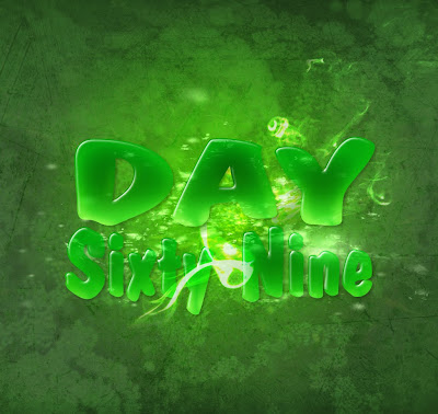
Day 69: Plastic Text gone Grunge


I was looking for a simple quick tutorial and ended up spending a bit too much time tweaking with the colors, the background and the texture effects. It's not spectacular but I like the background and the smoke effect.

Tutorial link

Monday, March 8, 2010

Day 68: Retro Space Text


Old school video game screen style. Ok results but nothing too fancy. Not much to say on this one.

Tutorial link

Sunday, March 7, 2010

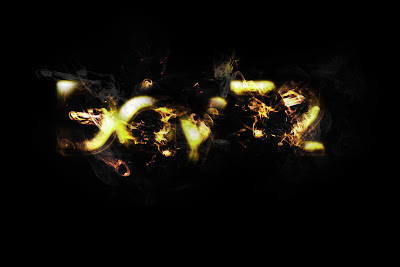
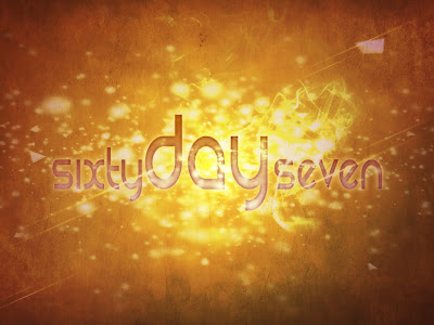
Day 67: Particle Glow Text


For this effect I used several particle image,a smoke image, and a rough background texture. By using color dodge as the blending mode combined with a significantly distorted series of text flares and a few layer styles the glowing effect and shatter effect looks slick. The smoke and particles came with 20-40 different images that I plan to take to work and make available to my kids.

Tutorial link

Saturday, March 6, 2010

Day 66: Creepy Texture Displacement


So I decided to try the displacement technique on a face. CREEPY!! I've included the original picture, texture and results.

Tutorial link

Friday, March 5, 2010

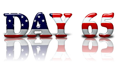
Day 65: Patriotic Text


Using displacement maps is something I rarely do but I should learn more. The basic premise is applying one image on top of another but having it distort around the first image. I've seen this done to image where the skin has been displaced with scales or a fruit peel replaced with wood texture. I'm interested in finding more tutorials that use this filter.

Tutorial link

Thursday, March 4, 2010

Day 64: Charlie Button


The button effect was created using a series of layer styles. The reflection in the upper right is hard to see since Charlie's hair and head are so light in the picture. I think a dark image would have shown off the reflection more but I liked this image of him :)


Tutorial link

Wednesday, March 3, 2010

Day 63: Sugar Bag Text


So, I'm currently tweaking out on this website called PSHero. His tutorials are easy to follow. Although many of the effects are not very overly complicated I like the beginner friendly explanations that I can use with my students. This involved a few layer styles and a slight offset of text. Not award winning but still interesting to learn different techniques.Tutorial link

Tuesday, March 2, 2010

Day 62: Notepad paper


This notepad paper was made from scratch using the single row marquee tool (which I've never even touched before!) It was fun to apply the shadows and the texture to the paper. I would like to tweak with the torn edges more to create a better effect. Overall cool!

Tutorial link

Monday, March 1, 2010

Day 61; Sticker Peel


Pretty nifty. I created a simple peeled sticker using several layers. After adding multiple layer styles I then developed the background. It started out as a close up of grass and a rusty iron texture. The color doesn't quite work for me but I like the overall effect of the grass. Perhaps if the green of the sticker and stripe was toned down it might match up better.

Tutorial link.