Sunday, February 28, 2010

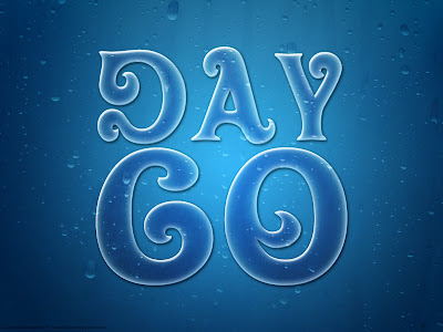
Day 60: Wet Text


Here is a straight forward text effect with several layer effects applied. I like how the insides of the letters appear to darken the background. This finishing touch was achieved by selecting the insides of the letters then selecting the texture and duplicating only that. Neat.

Tutorial link

Saturday, February 27, 2010

Day 59: Grunge Photo Effect


So here is a simple grunge effect applied to a photo of my nephew Charlie. It's a bit reminiscent of a skater magazine/movie poster grunge. It was create using a simple gradient map set to Overlay and a medium Smart Sharpen filter. Not too shabby.

I've included the before and after shot.

Tutorial link

Friday, February 26, 2010

Day 58: Wordy Barney


This was tutorial I found in a magazine. The original effect was done with a black and white photo of a guy with black horn rimmed glasses. It was much easier to recognize what you were looking at because of the stronger contrast between his skin and his hair and glasses. I'll have to try this effect again with another image. I spent quite some time working with this but I'm not overly blown over by the results. I did however get to tweak with brushes using Barney's name which made me happy :)

Thursday, February 25, 2010

Day 57: Duct Tape


No text effect today ... weird.

It's duct tape I built from scratch. A simple rectangle with torn edges, a pattern and texture overlay. The bubbles were created using a bevel and emboss layer. I downloaded another font to create the felt marker effect. Fun stuff.

Tutorial link

Wednesday, February 24, 2010

Day 56: Stitched Text


I used a simple custom brush (nothing more than a V painted with a soft edge brush) and applied it to a work path. The trick to colorize an white background layer that has a pattern overlay was cool (merely use a hue/saturation adjustment layer above it). I dropped a texture (shocking that I would use a texture) of fabric into the word. It's subtle but I think it looks good.

Tutorial link

Tuesday, February 23, 2010

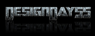
Day 55: Transformers Text


The transformer effect was created with a series of text layers slightly offset. The layer styles were basic but I did apply a preset texture that was in the Pattern overlay options that I didn't know existed. I'm stoked that I found another area in Photoshop that I rarely use.

If I had to pick nits, I think I should have pulled the 55 down lower to touch the reflection or left it up with the other letters.

Tutorial link

Monday, February 22, 2010

Day 54: More Woody text


This was a simple text effect but it looks pretty darn spiffy. I like the font and the overall effect. The major technique was merely using a series of layer masks and then applying a small white stroke to the layers.

Oh yeah... Happy Birthday to me :)

Tutorial link.

Sunday, February 21, 2010

Day 53: Memorial Card


This was created (in collaboration with Kathy) for the memorial service of an incredible guy. Kelly was a good friend, hilarious man and cookie master! I'm so happy to have known him.

Saturday, February 20, 2010

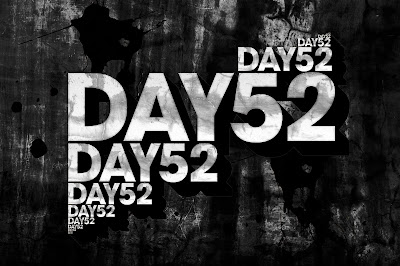
Day 52: Grungy 3D Text


Back to tweaking with textures and text again! I merged several different textures together to create the background. I took one of the textures and embedded it in the letters. I used a custom shape palmlike leaf to create more texture inside of the letters. The 3D effect is not spectacular but it will serve. The paint splatters were simple image downloads.

Tutorial link

Thursday, February 18, 2010

Day 50 & 51: HiFi Comic Color


So I've decided to work through the Hi-Fi Color for Comics book. I sat through a demo at Comic Con for Hi-Fi Design (a well known comic colorization studio). I picked up their book which teaches their techniques on computer colorization. This first page took quite a while to "flat". Flatting is the process of taking line art and laying down simple colors. All color comic pages start out at this level before more colors are layered on top of the flats to create a 3-D look. The author said that an average page takes about an hour to flat... hmmm I took nearly 2 1/2 but I did start to get faster as the night went on. I'm starting to memorize and apply a ton of tool bar shortcut keys which will help me speed up.

Here is the finished flat and the color version. In future posts I'll either show my work in progress or wait a few days until the work is complete...

Day 49: Heartbeat


This was a simple effect that was somewhat derivative of others I've seen. Essentially it was a simple font placed on a heartbeat line, rotate the text and apply the wind filter one way and then the other. The background was created using a gradient overlay and a spray filter. It's not one of the better effects I've tried but I did like the idea of erasing parts of the letters that touch the line.

Tutorial link
Wednesday, February 17, 2010

Day 48: Ice Text


I had mixed results with this one. The internal parts of the text work (they look icy and crystallized) however the icicles are really bad. I grabbed a snowy scene to try to emphasize the cold/icy nature of the text (also to hide the pretty crappy icicles).

Tutorial link

Tuesday, February 16, 2010

Day 47: Guts


It's a bit gruesome but I like the effect. I never use the Plastic Wrap filter or the Glowing edges filter so it was nice to see what they could create. Not sure about the practical application of this effect but for Zombie/horror type things I could see using something like this.

Tutorial link

Monday, February 15, 2010

Day 46: Grass Text


Wow, this was very, very time consuming. I had to individually trace each letter and then create multiple layers in order to create the shadows and grass effect. I like the overall look and feel but I wish I had the grass more saturated. The lady bug and butterfly really help to create some contrast against the green tone of the background and the text. I'm not sure that I'm overly stoked with the beveled effect on the text.

Tutorial link

Sunday, February 14, 2010

Day 45: Retro 70's Wavy Grunge


I started by creating a funky shape design for the inside of the letters. I applied three different paper textures and developed a quick vignette. The crease effect was simple to create and looks goods. I can definitely use several of these techniques for other projects.

Tutorial link

Saturday, February 13, 2010

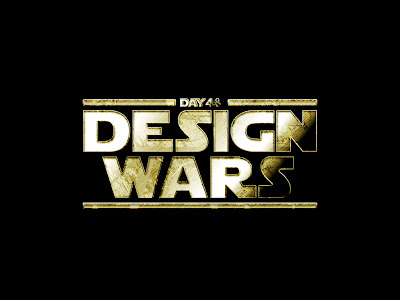
Day 44: Star Wars


This was a really fun one to do. I got to play around with more textures (it's currently my favorite thing to do in photoshop). I had to download a specialized font but the rest of the effect was created with a variety of blending modes and text stacked on top of each other. I liked the technique of adding noise then applying a motion blur and then an unsharp mask. This combined well with the marbled texture I found. I may have to do this one again for a birthday card or something for Jeff Thomas since he's a HUGE star wars fan.

Tutorial link

Friday, February 12, 2010

Day 43: Concrete Text


The tutorial was rather simplistic which may be why the effect is a bit rough. I continued to experiment with background textures. I found a concrete texture and a a brick wall texture. I desaturated the brick and applied an overlay to get it to blend in nicely with the concrete. It could almost be a CD cover... almost.

Tutorial link

Thursday, February 11, 2010

Day 42: Carbon Fiber Background


So I finally found a tutorial today that worked out! Yay! I had to do quite a bit of tweaking on my own to get it to work but I'm pleased with the results. Somewhat simple looking but the lighting and text layout looks solid.

Tutorial link

Day 41: Light Zoom Text


So this one is not spectacular either. I seem to be in a tutorial slump right now. I followed the directions but the radial blast doesn't work well with the word I used. I like the background effect I created on my own but the black dot in the center of the word is a bit distracting. Ah well...

Day 40: Rubber Stamp


This was a simple tutorial but I like the effect. The grunge texture was created using a construction site image that I converted to black and white using thresholds. I had to rotate the texture to align it with the text to ensure that I didn't erase too much of the letters. The instructions were a bit off but I could follow along easily by looking at the images.

Tutorial link

Day 39: Worst Tutorial to Date


So this was an utter waste of time. I tried to follow the directions over and over. The techniques were weak. I had to repeat the same steps over and over and nothing matched up. By the end of the tutorial I realized I didn't even like the effect the author was going for. Ah well they can't all be winners. I do like the background I was able to create. I found an old wallpaper texture and blended it with an abstract coffee stain kaleidoscope texture. The placement of the text is ok but not at all like the tutorial.

Tutorial Link

Sunday, February 7, 2010

Day 38: Stained Text


This design was created using multiple coffee stain and sumi brushes. That's pretty much it. The tutorial was not really that great. I like the overall effect but it didn't teach me any new techniques. It did remind me however that I rarely download brushes and I really should since you can quickly create some interesting things.

Tutorial link

Saturday, February 6, 2010

Day 37: Chrome Text and Blast


I like the futuristic effect of the cut lines in the text. It was created using a built in style (CHROME) and a Web Pattern (WovenWeave). I really like the quick way to create the speckles around the burst using a paint brush set to displace and then warping the selection. The glowing burst was created using a blurred dot then smudging and then applying an inner glow and outer glow.

Tutorial link

Day 36: Grungy Elephant?


So I created this text effect using elephant skins as a displacement map. The bevel/emboss may be a bit strong but I'm interested in learning more about displacement maps and how to control them. Fun, fun!

Tutorial Link

Day 35: Disco Text


This is the second video tutorial I've done. I was hesitant to do the noisy middle because I thought it looked cheap but once the other effects were added I like it. It has a 70's metallic sticker/paint look.

Tutorial Link

Thursday, February 4, 2010

Day 34: Tracey Text


This one speaks for itself... it's all about TRACEY! :)

The new noon is the original but I like the TEAM TRACEY better :)

Tutorial Link

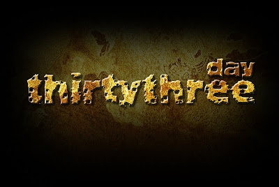
Day 33: Rocky Text-"ure"


Decent rocky effect. I merged three different textures together and manipulated the brush dynamics to create the holes in the text. The brush may have been a bit too big for the text (which made it more distressed than I would have liked.

Tutorial link

Day 32: Wood Text


No real strong feelings about this one. Applying the texture was relatively easy and the the orangy feel is not really that great. I do like the experience I'm getting with different ways to apply textures and lighting so I guess that is something. :)

Tutorial Link