Friday, April 30, 2010
Thursday, April 29, 2010
Day 119: Tracey Inkblot
Cool effect... I had to rework it several times to get the effect I wanted but I like the subject matter :)
Tutorial link
Tutorial link
Wednesday, April 28, 2010
Tuesday, April 27, 2010
Monday, April 26, 2010
Sunday, April 25, 2010
Day 115: Zombie Pussycat Doll
Before and After.
This was a tremendous amount of fun to do. Liberal use of the burn tool and lots of layers. Cool brushes and great way to tweak with skin tones.
Tutorial link
This was a tremendous amount of fun to do. Liberal use of the burn tool and lots of layers. Cool brushes and great way to tweak with skin tones.
Tutorial link
Saturday, April 24, 2010
Friday, April 23, 2010
Day 113: 1 hour Lunch Poster Ver.2
I tweaked with the idea of using a crazy, random picture and revised the text. Not much design change but the information is better organized.
Thursday, April 22, 2010
Day 112: 1 hour Lunch Poster Ver.1
I was asked to quickly create a black and white poster to grab kids attention about our proposed 1 hour lunch next year. Here is the first draft. I really should have used InDesign but I was in a groove with Photoshop. Once I started on the second draft I had issues with Photoshop. Speed blurs my decision making at times.
Wednesday, April 21, 2010
Day 111: Yearbook Awards
I needed a new sign for my wall of awards. This is a first draft. I want to tweak more with it because I'm not really happy with the results.
Tuesday, April 20, 2010
Day 110: Win Friends and Influence
This one was a rush job. I'm not pleased with the result and I think it was the least effective of my designs.
Monday, April 19, 2010
Day 109: 1000 Students
Another poster. I figured this one would grab more attention since it has pictures of students (They love looking at themselves).
Not too shabby :)
Not too shabby :)
Sunday, April 18, 2010
Day 108: Notebook Poster w/Barney
Another yearbook application poster. I spent quite a while putting this one together. The notebook image I used was a dull, gray color which I overlayed with an old paper texture. I created the Polaroid frames with some layer styles and then created the scotch tape. To finish off the background I downloaded a few sketches and blended them into the notebook.
I really like how this turned out!
I really like how this turned out!
Saturday, April 17, 2010
Day 107: NonCommie
I developed this one at the same time as the "Commie" poster. Perhaps I unconsciously knew the first one was too communistic so I was compensating with this one.
Friday, April 16, 2010
Day 106: Revolution
I had some fun developing marketing material for my Yearbook class. Here is the poster that was rejected by the school for advocating communism. Arghhh, I disagree but went ahead and took it down. Why do I feel like that was an unAmerican thing to do?
Thursday, April 15, 2010
Day 105: Bronze Text
I'm feeling kind of lazy lately and have busted out a few weaker effects. I tried to spruce this one up with a background image and a line. Not shabby but I'll get back on track soon and do better... I promise :)
Tutorial link
Tutorial link
Wednesday, April 14, 2010
Day 104: Type in Type
Here's another tutorial that was nothing fancy but still introduced a few interesting texture effects. I could have spent more time coming up with more text to fit into the four but I already spent more time than I really wanted to. I've seem similar word cloud effect before and even used Wordle.com before.
Tutorial link.
Tutorial link.
Tuesday, April 13, 2010
Day 103: Burnt Wood Text
Somewhat simple effect. A series of layer styles inner Shadow, Outer Glow, Inner Glow, Bevel, and Gradient. The Fill is set to 0%.
Tutorial link
Tutorial link
Monday, April 12, 2010
Day 102: Meat Text
I used Illustrator to create the letter forms and then pulled them into Photoshop. I'm not overly happy with the final effect but the process of creating a simple, geometric font in Illustrator was fun. With more time I could fix the meat and make the background and lettuce appear more realistic.
Tutorial link
Tutorial link
Sunday, April 11, 2010
Day 101: Illustrator Logo

It's been a while since I worked in Illustrator. The tutorial was not very descriptive but it did allow me to practice with the pen tool more. I'm going to use this as part of my Pen Tool introduction prior to logo design. The image of the gecko I used was not nearly as lean as the one in the tutorial so I had to adjust how to layout the text. It works well enough.
Tutorial link
*Update*
 I didn't like how pixelated the illustrator file looked so I increased the size and tweaked a bit in photoshop. Here is the second version next to the first.
Saturday, April 10, 2010
Day 100: Singing Apple

This tutorial I did I plan on using in my CGD class. It's a great intro to image manipulation and provides practice with the Pen Tool which I'm currently having them work on. The last few steps are a bit vague but I can walk them through ways to clean up the final image.
Tutorial link
Wow! I'm hitting the 100th day of my design work for 2010. I'm really happy with all of the techniques and tricks I've learned so far. The sheer volume of practice is worth so much more than the final results. I'm excited to hit the next big benchmark.
Friday, April 9, 2010
Day 99: Grungy Distressed Photo


This tutorial was very badly written and I was unable to follow it. i decided instead to tweak around with masks and some grunge brushes. It's ok... but nothing too spectacular.
For what it's worth... Tutorial link
Thursday, April 8, 2010
Day 98: Fire

I tried to follow a tutorial online but when I got to the site (photoshopgarden) it required that I fill out a stupid survey : Which Jersey Shore character are you? then it wanted my e-mail address and cell number so it could text me an access code... forget that, I hate Jersey Shore.
So I used my own method to create fire (or at least a fire-like effect). I used clouds then difference clouds. I created a second layer with more clouds. set it to overlay, erased some of the flames and viola. Not the best effect ever but I had fun tweaking on my own. I also made the text effect from scratch.
Wednesday, April 7, 2010
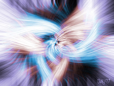
Day 97: Trippy Swirls

What a cool effect for only a few filters! I used clouds, pixelate:mezzotint, radial blur and distort:twirl. I duplicated the layer and applied a twirl in the opposite direction and changed the blending mode to Lighten. All that was left was to change the color of of each layer.
Trippy.
Tutorial link
Tuesday, April 6, 2010
Day 96: Color Changes


I tweaked with the lighting and eye color on this picture. Interesting effect although I'm not sure why the guy used the burn and dodge so much on the eye. The overall look of the final piece worked nicely.
Tutorial link
Monday, April 5, 2010
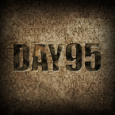
Day 95: Crappy Text

What a crappy text effect. It was nothing more than applying some clouds to the inside of text and then adjusting the Hue and applying a simple bevel. I took a background image of a cool calendar Tracey and I saw at the Getty. I applied another texture on top of everything in an attempt to salvage an otherwise crappy effect.
Moving on...
Tutorial link
Sunday, April 4, 2010
Day 94: Space Burst

A simple but cool looking lighting effect. I used a gradient and then applied waves, blur and then Polar Coordinates. Then I duplicated the background, adjusted the blending mode to screen and applied a Hue adjustment to the lights to make them orange.
Tutorial link
Saturday, April 3, 2010
Day 93: Grunge Gino
Friday, April 2, 2010
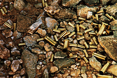
Day 92: Grunge Photo Again


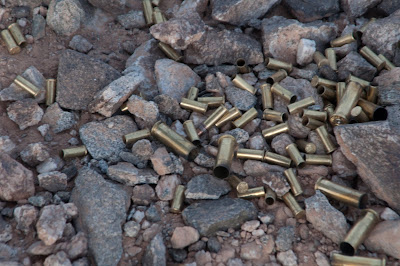
I found another way to create a cool grunge effect on a photo. I really like this technique. It was created by duplicating the layer (set to Hard light), duplicate this new layer and apply a High Pass filter (Set blending to Hard light), new layer with gradient (Set to Overlay), add noise and blur... viola!
I've included the before and after image. I took the photo when I was out camping in the desert.
Tutorial link
Thursday, April 1, 2010
Day 91: Ring of Fire

This was a ton of work to create. I ran into problems with the distortion of the fire to wrap the top portion. Overall, I really liked the techniques in this one and I love the simple red cloud-smoke for the background. This is one to revisit.
Tutorial link


